News

MyType — 07.15.10

MyType (Behind the Type) – Tomeri Nu-No

MyType (Behind the Type) – Tomeri Nu-No
Q: How did this typeface come to fruition and does Tomeri mean anything?

A: Tomeri was collaboration between Nuria Gonzalez and myself. This typeface was developed to premiere at a type expo called Tomeri. TO.ME.RI is an acronym using the first two letters from Toronto, Mexico City and Rio de Janeiro. The traveling exhibition showcases typefaces and type designers from their distinct cities, bringing a unique perspective to type and graphic design in the Americas.

Q: Give us some insight to the characteristics behind the typeface.

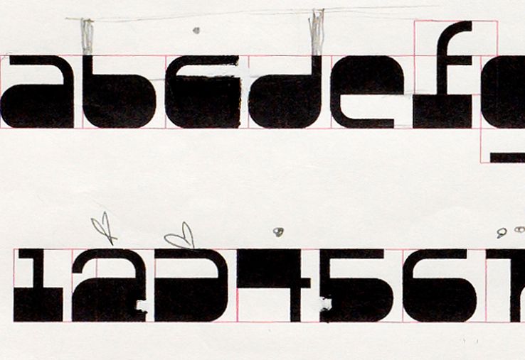
A: Tomeri serifs are heavy. They bottom out and keep it grounded to its baseline. This idea of a heavily weighted serif served as the initial inspiration when we developed the rest of the letterforms.

The poster, Tomeri ABC features the entire alphabet in several different sizes where as the poster, Tomeri KD displays overlapping/overprinted letterforms.

Tomeri ABC is featured in a book published by Die Gestalten, titled: “Playful Type” – Ephemeral Lettering and Illustrative Fonts.

Tomeri Nu-No [ABC]
Tomeri Nu-No [KD]
Size: 24”x 33” / 3 and 2 colour litho
Posters: designed by Noël Nanton @ typotherapy — 2008
Typeface: designed by Nuria Gonzales & Noël Nanton @ typotherapy — 2008

Process — 06.01.10

MyType—Tomeri Drawings Tomeri Nu-No Letterforms in Development
MyType—Tomeri Drawings Tomeri Nu-No Drawings

MyType—Tomeri Drawings

MyType—Tomeri Drawings
Drawings, touch ups, edits and selections for Tomeri Nu-No.

Typeface: designed by Nuria Gonzales and Noël Nanton @ typotherapy

MyType — 05.15.10

MyType (Behind the Type) – Neometric Neometric [Neo Type] Poster

MyType (Behind the Type) – Neometric

MyType (Behind the Type) – Neometric
The idea behind the Neometric typeface was to construct letterforms using four basic shapes, positive and negative space and be clever about it. Can you read what it says?

Neometric Black [My Typo]
Neometric White [Neo Type]
Size: 24”x 33” / 1 colour screen print
Posters: designed by Noël Nanton @ typotherapy — 2008
Typeface: designed by Noël Nanton @ typotherapy — 2008

MyType — 05.01.10

MyType (Behind the Type) – Quadrangle Quadrangle [Sixty Meter] Poster

MyType (Behind the Type) – Quadrangle

MyType (Behind the Type) – Quadrangle
We took a different approach to the challenge of designing a typeface with shapes. Unlike Neometric, Quadrangle was designed by establishing a grid to dissect the square shape into four triangles in order to create the letterforms. We are very pleased with the outcome—we love the almost Olympic sport-like feeling this typeface projects, hence the sports apparel in one of the posters.

Quadrangle [Sixty Meter]
Quadrangle [ABC]
Size: 24”x 33” / 4 colour litho
Posters: designed by Noël Nanton @ typotherapy — 2008
Typeface: designed by Noël Nanton @ typotherapy — 2008
Photography: Nadia Molinari

MyType — 04.15.10

MyType (Behind the Type) – Orbit36 Orbit36 [Attraction] Poster

MyType (Behind the Type) – Orbit36

MyType (Behind the Type) – Orbit36
Mass
Gravity
Equals
Attraction

With Orbit36, we wanted to create something that references the laws of attraction. This typeface is profound, heavy weighted and larger than life. The letterforms feel like solid objects fused together by its intentional kerning as if each of the letters were bound by gravity or a magnetic force.

Orbit36 [B]
Orbit36 [Attraction]
Size: 24”x 33” / 1 colour screen print
Posters: designed by Noël Nanton @ typotherapy — 2008
Typeface: designed by Noël Nanton @ typotherapy — 2008

MyType — 04.01.10

MyType (Behind the Type) – Typo-AG Rounded [G] Typo-AG Rounded [G] Poster

MyType (Behind the Type) – Typo-AG Rounded [G]

MyType (Behind the Type) – Typo-AG Rounded [G]
Out of all the letters in the alphabet we chose to highlight the [G] from Typo-AG Rounded. We found the [G] quite interesting because of its one straight edge, in an otherwise all rounded letterform. From this we were inspired to design a poster that is striking, black and highlights the [G], surrounded by hairline scratches. Typo-AG Rounded is a part of the Typo-AG family, which was designed along with VWmoblie as a part of typotherapy’s redesign of Ground Magazine.

Typo-AG Rounded [G]
Size: 24”x 33” / 1 colour screen print
Posters: designed by Noël Nanton @ typotherapy — 2008
Typeface: designed by Noël Nanton @ typotherapy — 2007