MyType — 09.01.10

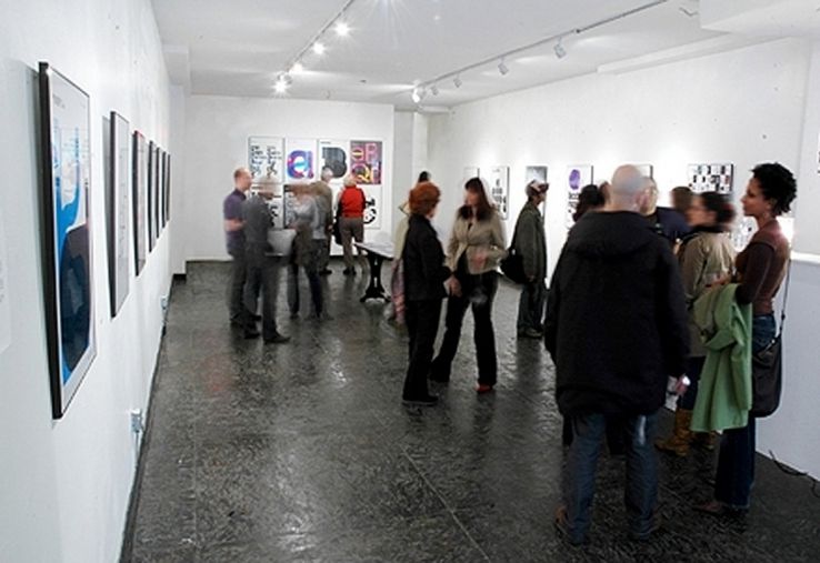
MyType Exhibition
While the show was a huge success, Noël reflects on the rational behind creating the typefaces for the posters featured in the show.

While the show was a huge success, Noël reflects on the rational behind creating the typefaces for the posters featured in the show.

A: We instantly gravitated to the VWmobile [aa] poster for the show’s brand personality. We felt that the overlapping letters is a very powerful yet common metaphor in type design when comparing letterforms. Furthermore we thought that this would be a prefect way of introducing people to the world of type.
VWmobile came into existence in 2007 when typotherapy was commissioned to redesign and rename the Ontario Association of Landscape Architects (OALA)’s magazine. Ground magazine was literary redesigned from the ground up – no pun intended. When we approach a new project, one of the first design elements we consider is the fonts. Often, typotherapy custom designs a font specifically for the project in order to give the brand a distinct identity. Thus VWmobile was born – a geometric, sans-serif font with a modern, inviting, easy-to-read look and feel. VWmobile is the font used for the body copy in Ground magazine.
The full VWmoblie family consists of: VWmobileA, VWmobileB, VWmobileC. They all include, light, light italics, bold, bold italics and display weights and contain letterform variations for the letters ‘a, b, f, and t’.
MyType VWmobile [aa]
Size: 24”x 33” / 3 colour litho
Poster: designed by Noël Nanton @ typotherapy — 2008
Typeface: designed by Noël Nanton @ typotherapy — 2007


A: This typeface Witruimte, was inspired by a trip to the Netherlands. I was totally impressed by how the Dutch embraced design, especially graphic design and typography. In Amsterdam, you see good design everywhere.
While there, I was introduced to the work of a remarkable Dutch designer and typographer, Wim Crouwel. I was impressed by Crouwel’s legacy in type design and mostly by a calendar he designed in 1963 called “Kalender ’64”. This led to an exploration of framing letterforms – as if each letter is in its own invisible picture frame.
Often, when designing letterforms we will first type out a word to get a glimpse at the new typeface. With regards to the creation of these framed letters, we immediately and instantly witness a unique juxtaposition between its positive and negative space, and Witruimte (wit ruimte) – literally means white space in Dutch was born.
The Witruimte poster features a play on words and numbers counting down from 1 to 9 in both English and Dutch.
Witruimte [1,2,3] English
Witruimte [1,2,3] Dutch
Size: 24”x 33” / 1 colour screen print
Posters: designed by Noël Nanton @ typotherapy — 2008
Typeface: designed by Noël Nanton @ typotherapy — 2008
A: Tomeri was collaboration between Nuria Gonzalez and myself. This typeface was developed to premiere at a type expo called Tomeri. TO.ME.RI is an acronym using the first two letters from Toronto, Mexico City and Rio de Janeiro. The traveling exhibition showcases typefaces and type designers from their distinct cities, bringing a unique perspective to type and graphic design in the Americas.
Q: Give us some insight to the characteristics behind the typeface.
A: Tomeri serifs are heavy. They bottom out and keep it grounded to its baseline. This idea of a heavily weighted serif served as the initial inspiration when we developed the rest of the letterforms.
The poster, Tomeri ABC features the entire alphabet in several different sizes where as the poster, Tomeri KD displays overlapping/overprinted letterforms.
Tomeri ABC is featured in a book published by Die Gestalten, titled: “Playful Type” – Ephemeral Lettering and Illustrative Fonts.
Tomeri Nu-No [ABC]
Tomeri Nu-No [KD]
Size: 24”x 33” / 3 and 2 colour litho
Posters: designed by Noël Nanton @ typotherapy — 2008
Typeface: designed by Nuria Gonzales & Noël Nanton @ typotherapy — 2008

Neometric Black [My Typo]
Neometric White [Neo Type]
Size: 24”x 33” / 1 colour screen print
Posters: designed by Noël Nanton @ typotherapy — 2008
Typeface: designed by Noël Nanton @ typotherapy — 2008

Quadrangle [Sixty Meter]
Quadrangle [ABC]
Size: 24”x 33” / 4 colour litho
Posters: designed by Noël Nanton @ typotherapy — 2008
Typeface: designed by Noël Nanton @ typotherapy — 2008
Photography: Nadia Molinari